National Multi Care Hospital
The website for a multi-specialty hospital in Nepalgunj, Nepal, in English, Nepali and Hindi. Almost everyone who opens it arrives on a phone, from a search result, and a fair number of them need something quickly.
Open nmhnepalgunj.com ↗In Nepali ↗In Hindi ↗
- Live since
- 16 September 2026
- Built in
- Next.js, exported static
- Now
- In use; the hospital is filling in what only it knows
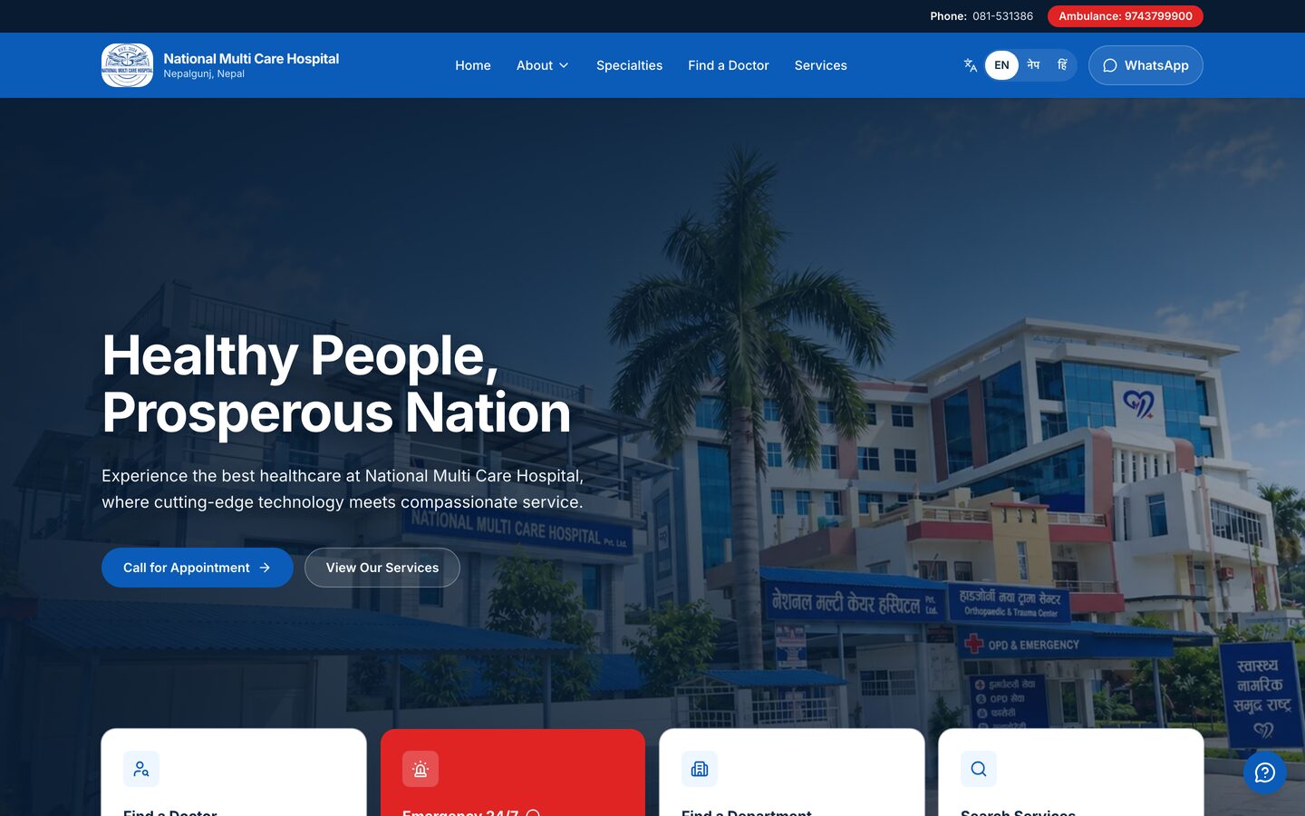
Why it exists
A hospital website is read under conditions that most websites never see. Someone is in a corridor, or in a vehicle, or holding a referral slip they cannot fully read. They want three things: the number to call, whether the place is open, and whether anyone there treats what is wrong.
Nepalgunj sits in the Terai, close to the Indian border, and the hospital draws from a district much larger than the city. The hospital asked for Nepali and Hindi alongside English, which tells you something about who walks in. They arrive on a phone, on mobile data they pay for by the megabyte.
So the site is built around those conditions rather than around a brochure. Every page keeps the phone, WhatsApp and the ambulance within thumb reach. Every page exists in all three languages. The homepage, photographs and all, is 200KB.
The harder part was not the building. It was deciding what the site is allowed to say.
What a patient does with it
1Call, without reading anything
The bar along the bottom is on every page, in every language. Call and Ambulance are
tel:links that open the dialler; WhatsApp opens a chat with the message already written. None of it needs the page to be read, which matters when the person holding the phone cannot read the language it is in.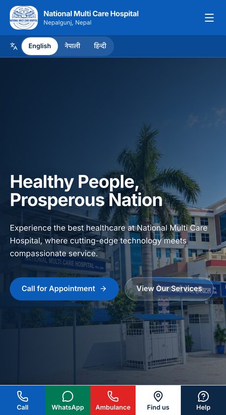
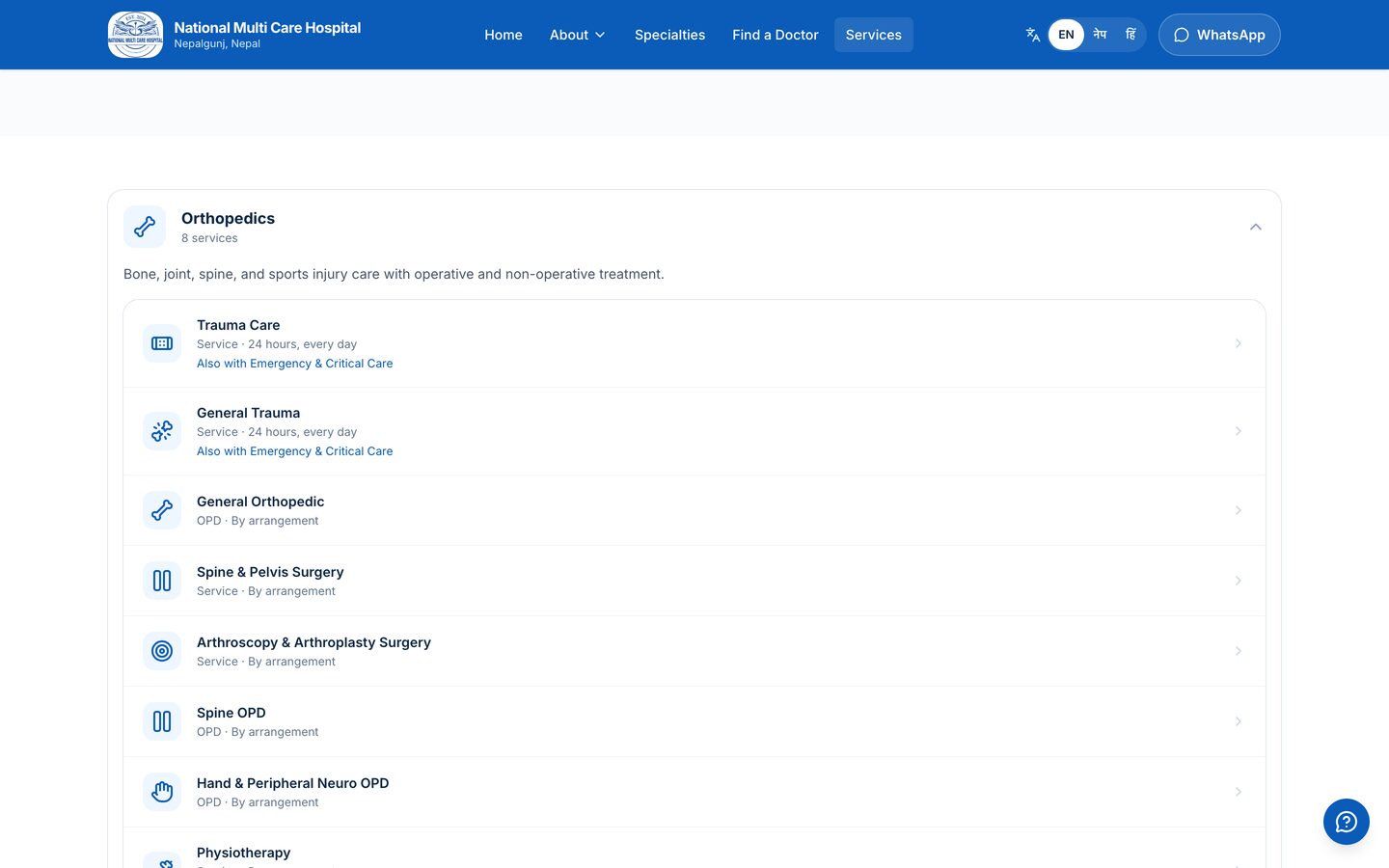
2Find the department, not the brochure
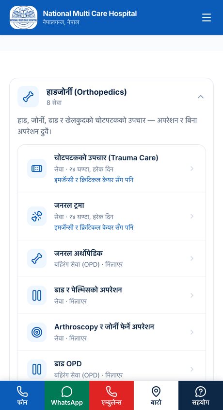
Thirty-five services across twelve departments, as one collapsed row each. It used to list them all open at once — ten screens of scrolling on a phone — with a separate jump list above that indexed the same twelve things. Now the index and the content are the same object, and eight departments fit in one screen.
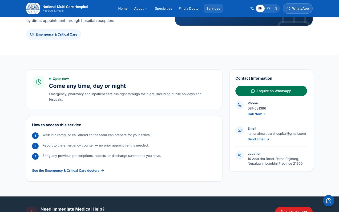
3Find out when, and get told the truth
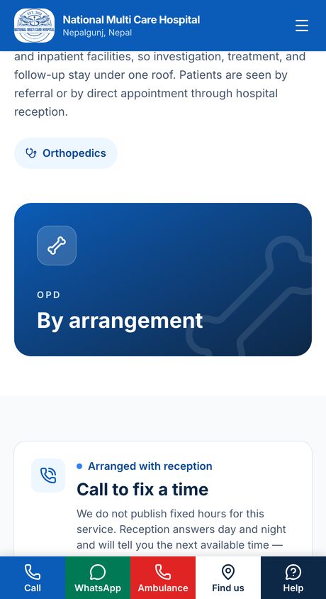
Each service says either 24 hours, every day or call to fix a time. Nothing in between, because nothing in between is known. The hospital cannot guarantee fixed hours for visiting consultants, so the site does not print any.
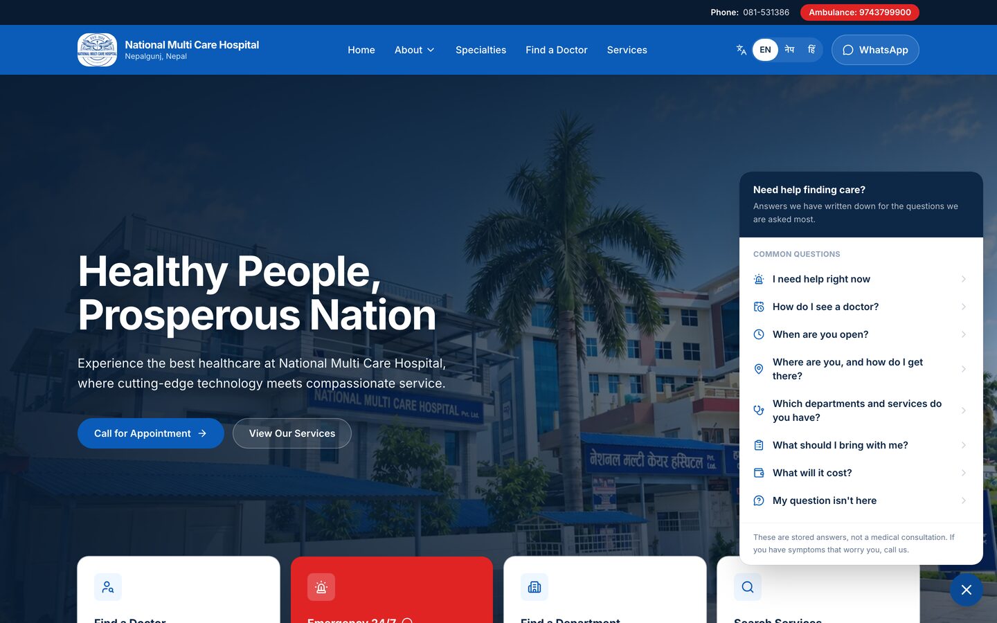
4Ask a question without asking a model
Eight questions a patient actually asks, each resolving to one answer written in advance and translated twice. No model, no third-party script, no network call. The panel says so at the bottom: these are stored answers, not a medical consultation.
What it holds
- services
- 35
- departments
- 12
- clinicians
- 8
- languages
- 3
- pages
- 198
- photographs
- 20
- short films
- 9
- interface strings, each translated twice
- 365
The twenty photographs are the hospital's own rooms and staff. Faces of patients and relatives are covered, not cropped around — the distinction matters, and is the subject of one of the choices below. On a phone the homepage is 14 requests and 200KB; no page contacts a third party on load.
Choices that shaped it
- Never print an hour nobody confirmed
- An earlier version generated a weekly timetable for each service. It looked authoritative and it was invented, and one generated row read Saturday: Emergency only — Closed. A patient reading that would not have travelled on a Saturday. The tables were deleted at source, with a comment in the data file explaining why they must not come back.
- Faces covered, not cropped around
- Several photographs contain patients and relatives. The temptation is to crop until no face is in frame, and one photograph shipped that way: the physiotherapy room reduced to carpet, a gait ladder and a traffic cone, with the room itself thrown away. Masking the faces keeps the room and makes the consent question moot rather than answered.
- Say nothing the hospital cannot back
- No accreditations, because none were supplied. No charges, because that decision is not ours. No
aggregateRatingin the structured data even though the Google listing carries 4.8 from 33 reviews — those are Google's reviews, not the hospital's to re-declare. An absent section is a better state to sit in than a plausible-looking one. - Someone else's data allowance is not free
- The framework prefetches every linked page that scrolls into view. On the homepage that was 826KB of speculative download, including the Nepali and Hindi copies of the page the visitor was already reading. The Google Maps embed on the contact page was another 447KB across seventeen third-party requests, on every single visit, and marking it
loading="lazy"did nothing because on a phone it sat inside the browser's preload margin. Prefetch is off and the map is behind one tap. - Gates for the failures that look like success
- Nine checks run on every push, and most exist because something had already shipped while looking perfect. The worst: a canonical tag set once in the root layout propagated to every descendant, so 202 pages told Google that the canonical version of themselves was the homepage — while the sitemap offered them as 204 separate URLs. Nothing about the site looked wrong. Others catch a page rendering in the wrong language, a missing or duplicated meta description, and prose counts drifting from the catalogue.
What it is still missing
- Pre-visit instructions. Nothing tells a patient to fast, or to bring a referral. It is the gap most likely to cost someone a wasted journey, and it cannot be guessed — an earlier attempt to derive it told ENT endoscopy patients to do bowel prep.
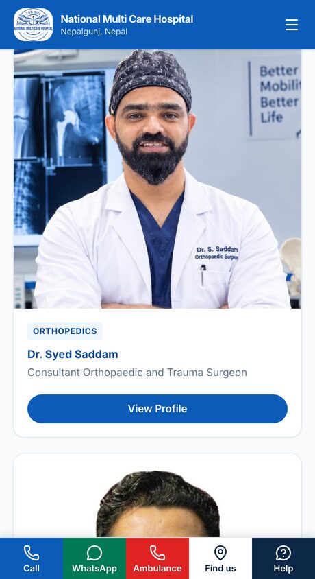
- Two departments are listed with services but no named consultant. They read as available by arrangement, which is accurate, but a department page with nobody on it is a thin page.
- The Health Library is empty. The publishing path works; there is nothing to publish yet.
- The hospital's name is still fragmented across the web — the older films and a Facebook URL carry a previous name, and an abandoned domain still resolves. Google's own summary hedged and called the hospital by both names at once. That, rather than anything on the site, is the real ceiling on being found.
What happens next
The engineering queue is empty. What is left is the part only the hospital can supply: the pre-visit instructions, whether charges may be published, and the first announcement. Everything is built to render only when that content exists, so the site is complete at every stage of being filled in rather than showing an empty shelf.
Built with Next.js as a static export, hosted on Netlify, with the catalogue of departments, services, clinicians and photographs held in typed data files rather than a CMS. Photographs and film are the hospital's own, published with its permission. Clinician names, qualifications and Nepal Medical Council registration numbers are as the hospital supplied them. Accessibility verified with axe-core across twelve routes at a phone viewport, WCAG 2.1 A and AA.